18
06Remjs solves the problem of mobile terminal adaptation
Nowadays, mobile devices have a variety of screen sizes, such as the iPhone SE to iPhone Plus, Android devices, and more. For user experience, we have to adapt to different screens. In mobile page production, we will generally replace the unit px with rem, and then through media queries, js calculations, etc., modify the size of the html font size, so as to modify the overall page size, hit the fitting effect. On the big screen, the text is slightly larger and the text on the small screen is slightly smaller. The overall ratio seems to be the same.
For rem, this is described on the W3C official website: "font size of the root element". On a web page, rem has only a fixed reference value. Unlike em is not fixed.
As mentioned earlier, using media queries for adaptation. This requires writing a variety of situational judgements. Depending on the screen width, set the html font-size to a certain width. It is inconvenient to maintain.
The other is to calculate the font-size of the html by calculating the screen width by js.
In my actual work project, this approach is also adopted. When building a page, a piece of rem.js code is added to the head. This code is used to dynamically set the font-size of the root element based on the screen page width.
Code show as below:
There is a paragraph in the first few lines of code option = html.getAttribute("data-use-rem");. This is to get the default UI design width size configured on the page. We use 750px. Then on the html page, data-user-rem="750" such a property will be added to the html tag .
Example
We convert px/rem 100 times. The px2rem function was written in sass.
Example
//width:rem(100) or width:rem(100px)
@function rem($values) {
    @if length($values) == 1 {
        @return px-to-rem(nth($values,1))
    }
    @else if length($values) == 2 {
        @return px-to-rem(nth($values,1)) px-to-rem(nth($values,2));
    }
    @else if length($values) == 3 {
        @return px-to-rem(nth($values,1)) px-to-rem(nth($values,2)) px-to-rem(nth($values,3));
    }
    @else if length($values) == 4 {
        @return px-to-rem(nth($values,1)) px-to-rem(nth($values,2)) px-to-rem(nth($values,3)) px-to-rem(nth($values,4));
    }
}
@function rm-unit($num) {
    @return $num / ($num * 0 + 1);
}
@function px-to-rem($values,$browser-base-num:100) {
    @return (rm-unit($values)/rm-unit($browser-base-num))*1rem;
}
In the UI diagram, we use the rem for measuring the size, for example, the UI has a width of 80px. When writing scss, it is written width: rem(80). The text size on the UI is 32px, and the scss is written font-size: rem(32).
The purpose of this is to reduce our artificial calculation conversion px2rem.
In addition, rem this unit is not a panacea, sometimes we should use px or use px, mobile end to adapt its practical px,% in most cases is completely OK. There are vw, vh, etc.
By Thirumani Raj posted on - 18th Jun 2018

Social Oauth Login

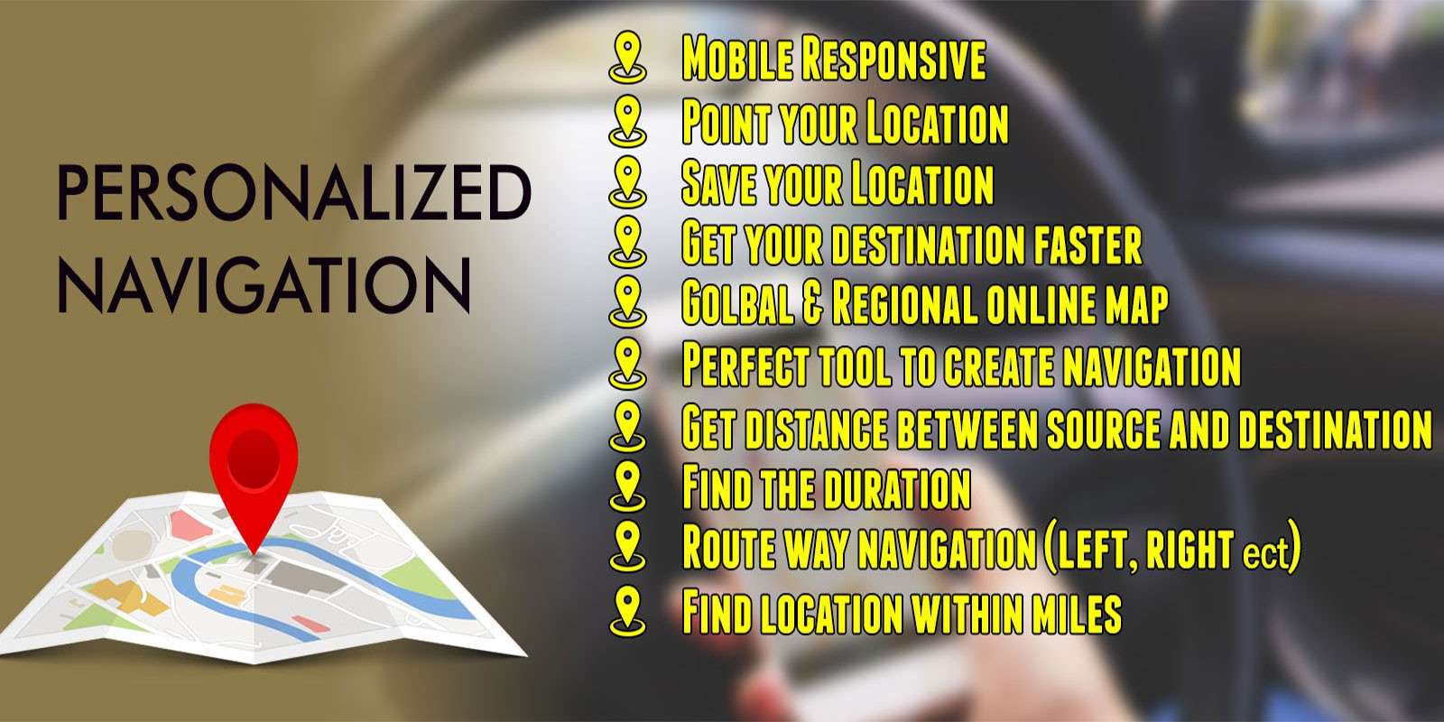
Personalized Map Navigation
Online Image Compression Tool
Image CompressionAdvertisement


Recent Posts
- « Personalized Map Navigation
- « Remjs solves the problem of mobile terminal adaptation
- « Picture centered vertically
- « Colorful Diwali Wishes Share Via Whatsapp and Facebook
- « Get City and State by ZipCode Using Google Map Geocoding API